Mother’s Choice
Mother’s Choice is a Hong Kong non-profit best known for their work in helping teenagers cope with crisis pregnancy. Since 2013, we have worked on two website revamps and several marketing sites.
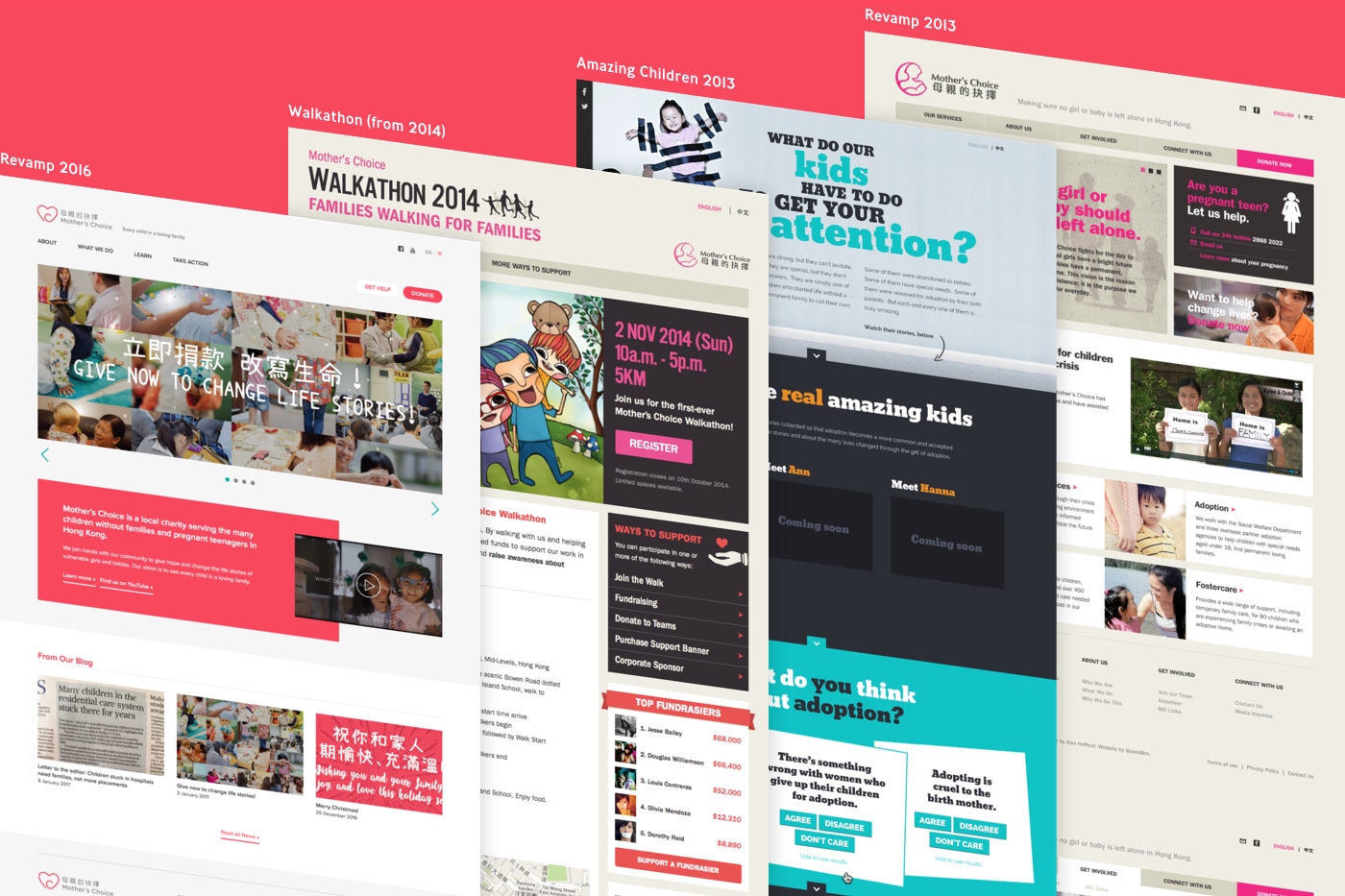
First Revamp (2013)
Mother’s Choice came to us in the summer of 2013, looking to revamp their website for their Adoption Awareness Month campaign. At the time their website was not mobile-friendly, and they felt that their values and services could be better communicated.
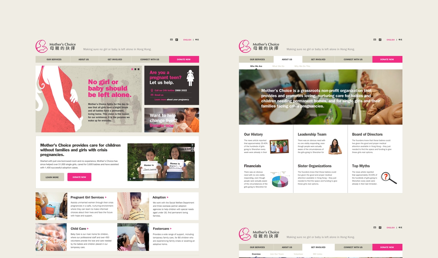
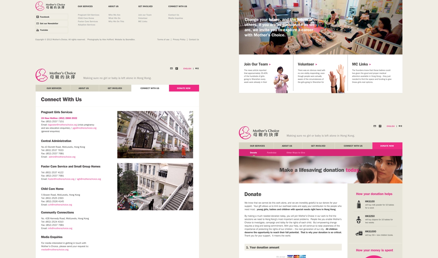
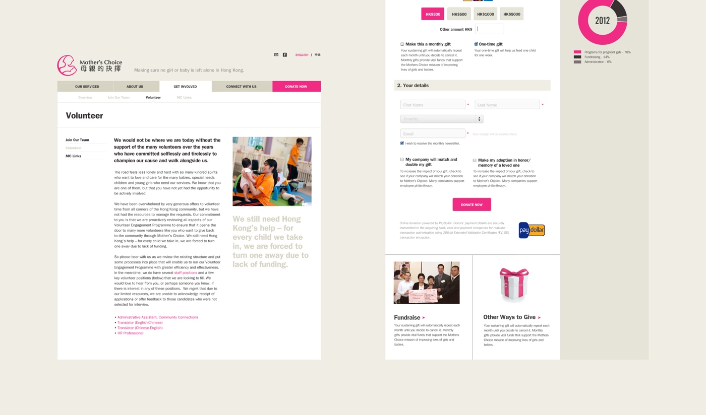
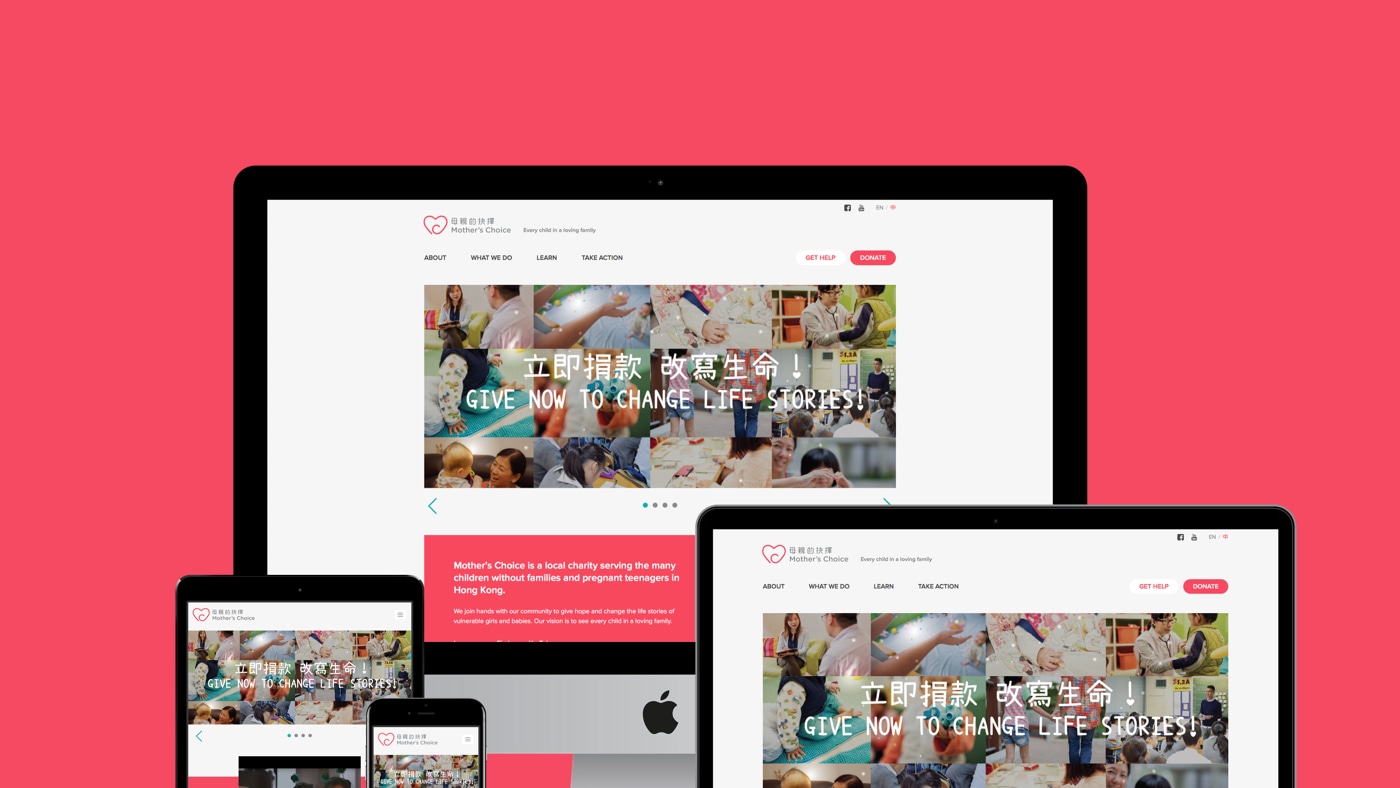
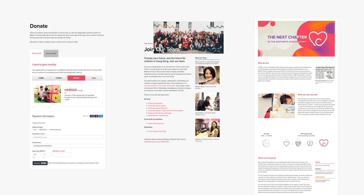
We revamped the website with a fully responsive layout, improved content structure, simpler navigation, and more readable pages with engaging visuals. The redesigned online donation form also helped conversions, as did our decision to ditch PayPal in favour of PayDollar to accept both one-off and monthly donations.
Campaign Site: Adoption Awareness Month
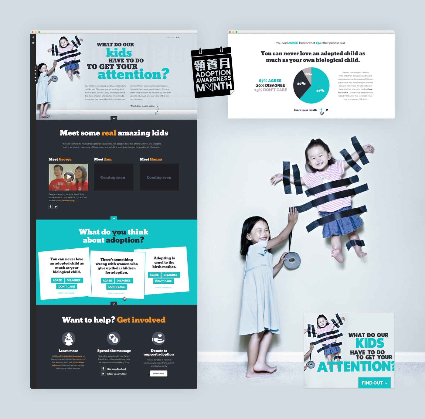
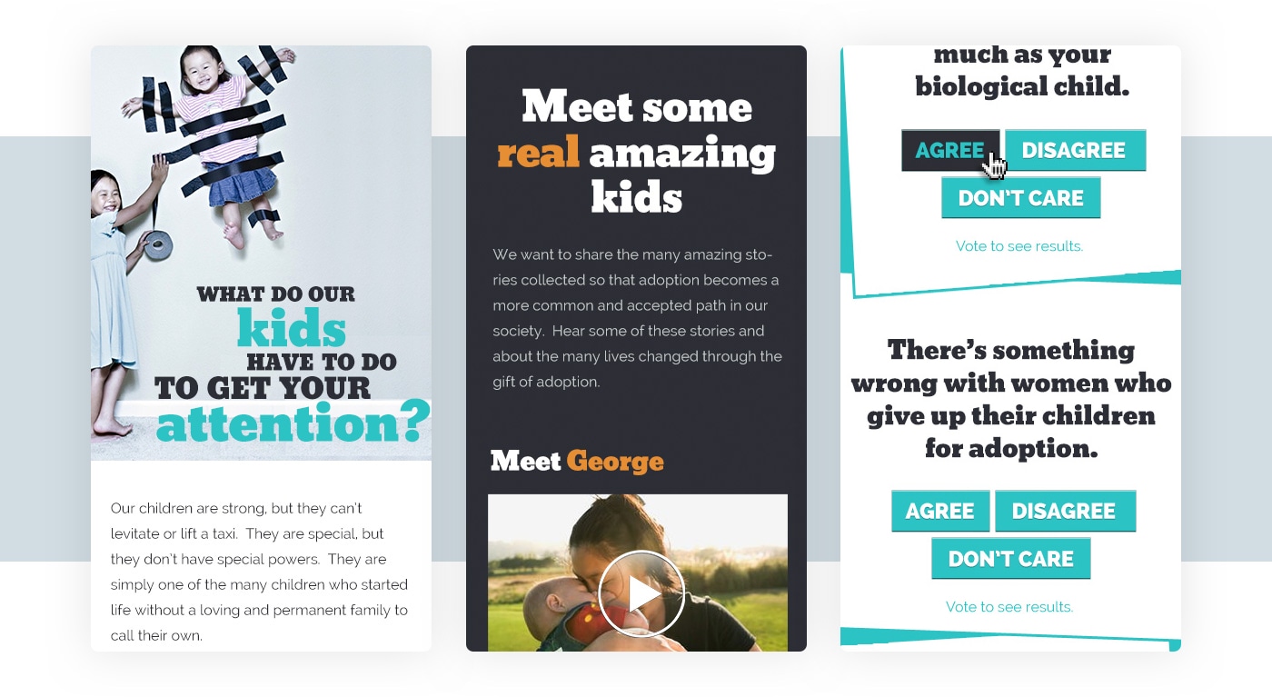
Alongside the website revamp, we designed a separate campaign site for Adoption Awareness Month. The single-page site featured video interviews with adoptive families, along with an interactive survey confronting people with their preconceived notions of adoption.
Campaign Site: Families walking for families
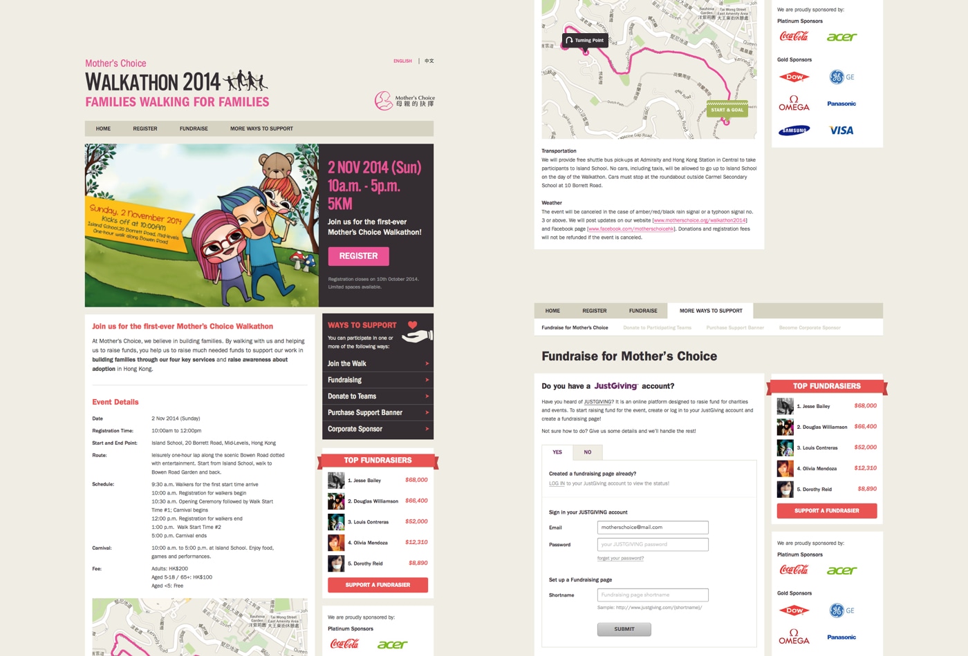
Towards the end of 2014, Mother’s Choice started the campaign “Families Walking for Families”, its first-ever walkathon. We integrated the site with JustGiving, allowing teams to create their custom fund-raising page and receive donations online. We then showed the progress and generated excitement with a leaderboard on the website. The walkathon was a success and has been held annually since.
Second Revamp (2016)
In 2016, Mother’s Choice rebranded with their new vision:
“We don’t just want to be there at a point of crisis for young girls and children. We want to see a community so supportive of pregnant teenagers and children without families that they open their own hearts to help, and organisations like Mother’s Choice are no longer needed.”
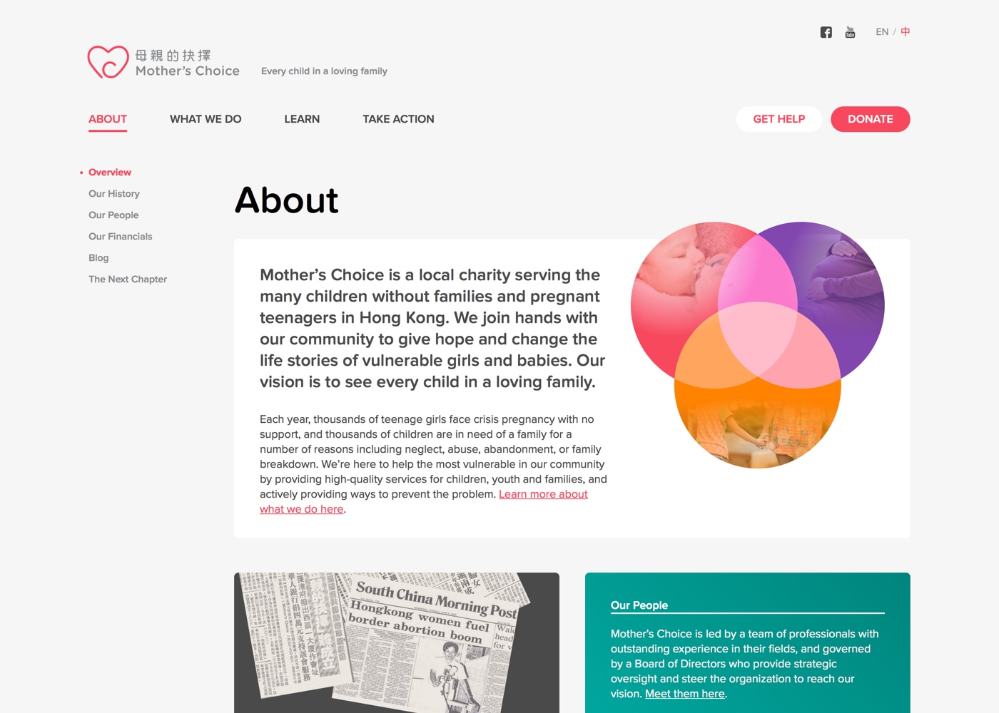
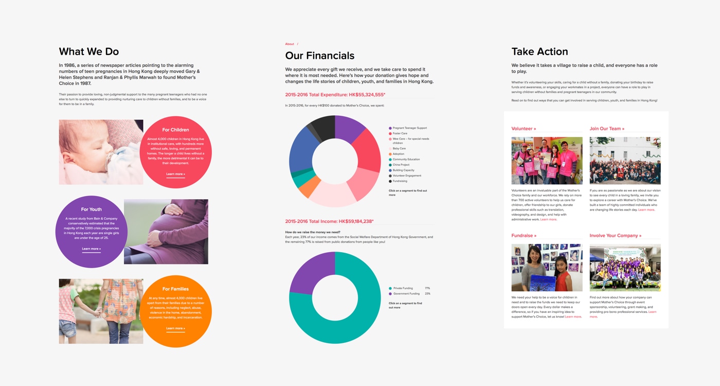
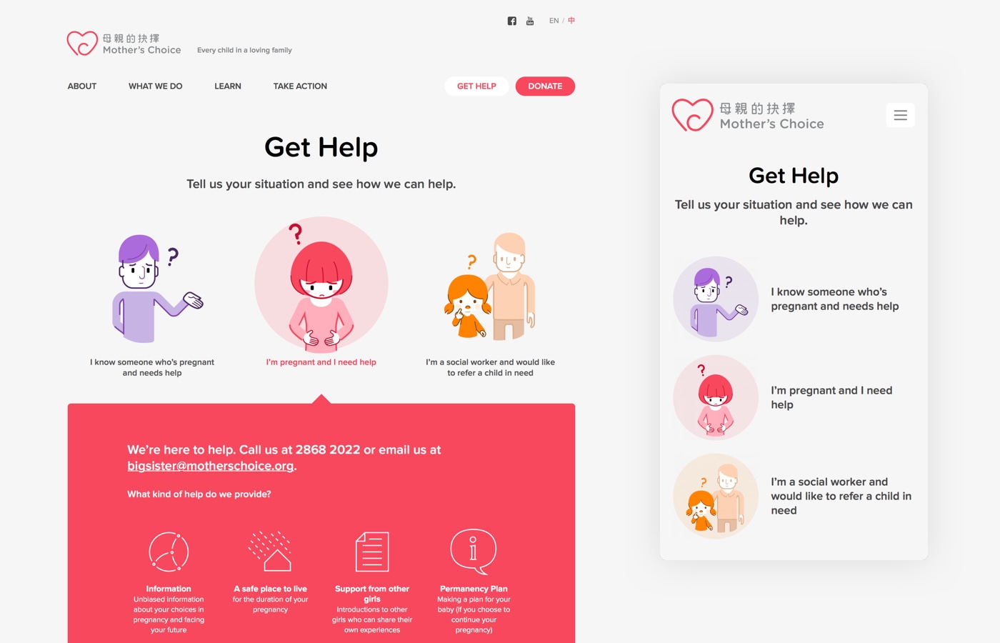
While Ogilvy and Brand Union worked on the new visual identity, Mother’s Choice once again enlisted our help in revamping the website to match the rebranding. We also used this opportunity to evaluate what worked well and introduce several enhancements, also making the CMS easier for the client to use in the process.
